Matching Rosewood Furniture to Your Flooring
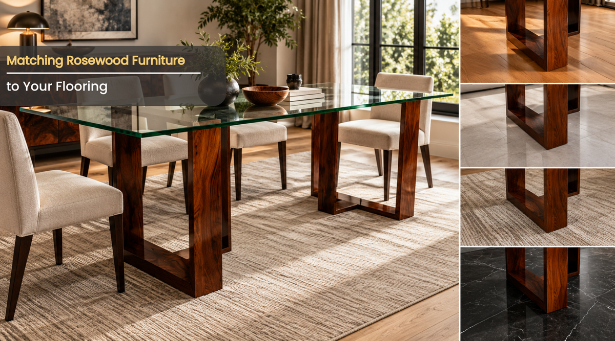
Rosewood reads as a warm red-brown carrying darker streaks that run from purple through near black, with occasional golden orange in the lighter boards. Against a floor of a similar tone and value, that palette flattens: the furniture stops standing away from the ground plane and the whole room reads muddy. Against a floor two or more steps lighter or darker, the same piece looks deliberate.
The rule interior designers apply is contrast or commitment, never near-match. A floor that almost matches your furniture draws the eye to the small difference and makes both look wrong. A floor clearly lighter, clearly darker, or in a different material entirely lets each surface do its own job.
Undertone decides this more than color name does. Two floors described as medium brown can carry completely different undertones: one red, one yellow, one gray. Rosewood’s red-brown clashes with a red-undertone floor such as red oak and sits comfortably against a neutral or cool one such as white oak or polished concrete. Getting the undertone right matters more than getting the shade right.
This article covers how to identify rosewood’s undertone in your own pieces, why near-matching fails, how much contrast to aim for using light reflectance value, what works against nine common floor types, how rugs act as a buffer when the floor is fixed, how wall color completes the balance, how to test a combination before committing, and a working formula for rooms with dark floors already installed.
Identifying the undertone in your own rosewood
Undertone is the residual color you see once you set the obvious color aside. Rosewood’s is warm and red-leaning in most Dalbergia Sissoo, though individual boards vary because no two pieces carry the same figure.
Test it with white paper. Hold a sheet of plain printer paper flat against the wood in daylight and look at the edge where the two meet. Against true white, the wood’s bias reveals itself: red-brown, orange-brown, or brown with a purple cast. That reading is the number you design against.
Do it three times through a day. Morning north light, midday, and evening lamp light produce different answers, and a room has to work in all three. Furniture that looks perfect at 10 in the morning and orange at 8 at night has an undertone conflict with the artificial lighting, which is a separate problem covered in the Boston Mills guidance on lighting rosewood.
Age shifts the reading too. Dalbergia Sissoo darkens and warms across the first two to three years of exposure, so a new piece has a lighter, redder undertone than the same design bought five years ago. Plan flooring against where the wood is heading, not only where it starts.
With the undertone established, the failure mode becomes easy to explain.
Why near-matching looks wrong
The eye is far better at detecting small differences than large ones. Two browns separated by one shade register as a mistake, because the brain reads them as an attempt at matching that missed. The same two browns separated by four shades register as a deliberate pairing.
Grain scale compounds it. Rosewood carries dense, fine figure with sharp dark streaks. Oak carries open pores and wide cathedral arching. Put a rosewood credenza on a red oak floor of similar tone and the two patterns compete at similar visual weight, which is busier than either would be alone.
Sheen adds the third variable. A French polished surface reflects light with depth and a soft glow, described in more detail on the French polish page. A satin polyurethane floor reflects flatly. Similar colors at different sheens look like a color mismatch even when the pigment is close.
Matching does work in one situation: when floor and furniture are the same species with the same finish, installed as a coordinated scheme. That is a commitment, not a coincidence, and it requires the walls and textiles to carry all the contrast instead.
For everyone else, the practical question is how much separation to build in.
How much contrast, measured properly
Light reflectance value gives a number to work with. LRV runs from 0 for absolute black to 100 for pure white, and most paint and flooring manufacturers publish it. Rosewood sits low, generally in the 10 to 25 range depending on board and age.
Aim for a difference of at least 20 LRV points between furniture and floor. Below that gap the two surfaces blur together at normal viewing distance. Above it, each reads distinctly.
That gives two workable directions:
- Lighter floor, LRV roughly 40 to 65: pale oak, ash, light stone, natural concrete. Rosewood reads as a dark anchor and the room feels open.
- Darker floor, LRV under 10: ebonized wood, dark slate, charcoal carpet. Rosewood reads as a warm glow against a recessive ground.
The middle band, LRV roughly 20 to 35, is the difficult zone. Medium brown floors sit close enough to rosewood to compete and far enough to look unintentional. Rooms with these floors need a rug to create the separation the floor cannot.
Value contrast is only half the answer, because a floor with the wrong undertone still fights the furniture even at the right LRV. Species by species, the picture is specific.
What works against nine common floor types
White oak, natural or clear-finished. The strongest pairing. White oak’s neutral to slightly cool undertone gives rosewood room to be warm, and the LRV gap usually exceeds 30 points. Works with both the Heritage Collection and modern silhouettes.
Red oak. The hardest pairing. Red oak’s pink-red undertone runs parallel to rosewood’s, so the two either merge or clash depending on the light. Use a large neutral rug to separate them, or replace the finish with a white-washed or gray-toned stain that neutralizes the pink.
Walnut. Workable with care. Walnut is cooler and grayer than rosewood, and the two coexist when there is a clear value step and a difference in grain scale. Avoid pairing a heavily figured rosewood top with a heavily figured walnut floor in the same sightline.
Maple and ash, light finish. Very good. High LRV, fine grain, neutral undertone. The main risk is coldness, which warm textiles and warm lighting resolve.
Dark stained or ebonized wood. Excellent when the floor goes genuinely dark rather than merely deep brown. Rosewood glows against near-black. Add a mid-tone rug so the room does not read as one continuous shadow.
Gray-washed engineered plank. Good, with one condition. The cool gray undertone contrasts pleasantly with warm rosewood, but the room needs warmth elsewhere: brass, leather, textiles. The brass inlay detail on Boston Mills pieces does useful work here.
Polished concrete or screed. Excellent. Neutral, high LRV, no grain competition. Concrete’s texture flatters fine hardwood better than almost any wood floor.
Natural stone: travertine, limestone, marble. Excellent. Stone carries pattern at a completely different scale from wood figure, so the two never compete. Warm stones favor rosewood particularly well.
Terracotta and saltillo tile. Risky. Strong orange-red undertone at a similar value to rosewood produces the same competition as red oak, with more intensity. Large neutral rugs are essential.
When the floor is already installed and wrong, the rug becomes the design tool.
Using rugs as the buffer layer
A rug changes the ground plane under the furniture, which is where the conflict actually happens. It does not need to cover the room. It needs to sit under the pieces and extend beyond them.
Size by function:
- Living areas: front legs of all seating on the rug, minimum.
- Dining areas: 24 to 30 inches beyond the table edge on every side so chairs stay on when pulled out.
- Bedrooms: extending 18 to 24 inches past the bed on three sides.
Choose the rug against the furniture, not against the floor. A rug that mediates between a red oak floor and rosewood furniture works best in a neutral: oatmeal, stone gray, unbleached wool, or a low-contrast natural fiber such as jute or sisal. Neutral ground gives the wood somewhere quiet to sit.
Avoid rugs that introduce a third competing brown. Patterned rugs in mixed browns and rusts multiply the problem rather than solving it. If pattern is wanted, keep it tonal within one color family and low in contrast.
One practical note for homes with radiant floors: keep rug and pad insulation modest, since heavy layers create hot spots under furniture. Stable conditions matter as much as color here, and the Boston Mills notes on seasonal care through the year cover what changes between winter and summer.
With floor and rug settled, the walls decide whether the room resolves.
Wall color as the third element
Walls carry the largest surface area in most rooms, so they set the overall value key. Three approaches work with rosewood.
Warm off-white walls, LRV 70 to 82, give maximum contrast against the furniture and let the wood act as the visual anchor. This is the safest choice with any floor and the most common in showrooms for that reason.
Deep saturated walls, LRV under 20, put the furniture and the walls in the same value family and force the contrast into the textiles and metalwork instead. Dramatic, and it needs strong artificial lighting to keep the wood readable.
Mid-tone walls in a cool family, LRV 35 to 55 in green-gray, blue-gray, or muted sage, flatter rosewood’s warmth by opposition. This is the most sophisticated of the three and the least forgiving of a poorly chosen floor.
What to avoid: mid-tone warm beige and taupe walls, LRV 40 to 55 with a red or orange undertone. That family sits in the same undertone lane as the furniture without enough value contrast, and the room reads flat regardless of what the floor does.
Testing any of these combinations before committing is straightforward and worth doing.
Testing a combination before you commit
Get physical samples. A flooring sample board at least 12 inches square, a rug swatch, a paint sample at least 8 by 10 inches on card, and either your existing rosewood piece or a finish sample from the maker.
Lay them as they will sit in the room: floor sample flat on the ground, rug over part of it, furniture sample standing upright against them, paint card vertical behind. Viewing samples flat on a table gives a false reading, because the ground plane and the vertical plane receive completely different amounts of light.
Photograph the arrangement with a phone and look at the photograph. A camera flattens color relationships and often reveals a clash that the eye compensates for in person.
Check it at four times: morning, midday, late afternoon, and at night under the actual lamps you will use. Rooms fail at the fourth check most often, because warm bulbs push everything in the room toward orange and can collapse a carefully planned contrast.
Boston Mills showrooms can supply finish references for this exercise, and the trade program supports designers specifying across a whole scheme.
A working formula for existing dark floors
Dark floors already installed are the most common starting point, and they are more workable than people assume.
Follow this order. Establish the floor’s undertone against white paper. Choose a rug at least 30 LRV points lighter than the floor, in a neutral without a competing brown. Place the rosewood so its footprint sits mostly on the rug rather than on bare floor. Keep the walls at LRV 70 or above. Add one reflective element per sightline, whether brass, glass, or a mirror, to break the accumulation of dark surfaces.
Scale the furniture up rather than down. Dark floors absorb light and make a room feel smaller, and small pieces scattered across them disappear. One substantial piece such as the BECRUX sideboard reads better than three slight ones.
Then light the wood directly. Dark floors plus dark furniture need accent lighting on the furniture itself to keep the grain visible, which is where the room stops looking heavy and starts looking rich.
What floor color goes best with rosewood furniture?
Light natural white oak works best, with a light reflectance value around 45 to 60 against rosewood’s 10 to 25. The 30-point gap separates the two clearly, and white oak’s neutral undertone leaves rosewood’s warmth uncontested. Polished concrete and pale stone perform equally well.
Can I put rosewood furniture on a red oak floor?
Yes, with a neutral rug between them. Red oak’s pink undertone runs parallel to rosewood’s red-brown, so the two compete when they touch. A large oatmeal or stone-gray rug under the furniture footprint resolves it, as does a gray-toned refinish of the floor.
How much contrast should there be between furniture and floor?
At least 20 LRV points, and 30 or more is better. Below 20 points the two surfaces blur at normal viewing distance and the room reads muddy. The awkward zone is a medium brown floor around 20 to 35 LRV, which needs a rug to create the separation.
Does rosewood work with gray floors?
Yes, and the pairing is one of the strongest available. Cool gray opposes rosewood’s warmth, which makes both read more clearly. Add warmth elsewhere through brass, leather, and textiles so the room does not turn cold.
Should the rug match the furniture or the floor?
Neither. Choose a neutral that sits apart from both: oatmeal, stone gray, unbleached wool, jute, or sisal. A rug that echoes the furniture tone doubles the brown, and a rug that echoes the floor removes the separation you needed the rug for.
What wall color suits rosewood furniture?
Warm off-white in the LRV 70 to 82 range is the safest and most common. Cool mid-tones in green-gray or blue-gray flatter rosewood by opposition. Avoid mid-tone warm beige and taupe, which share the wood’s undertone without enough value contrast.
Will rosewood clash with a dark stained floor?
No, provided the floor goes genuinely dark rather than deep brown. Rosewood glows against near-black. Add a mid-tone neutral rug and keep walls light so the room reads layered instead of uniformly heavy.
Does rosewood furniture change color enough to affect my floor choice?
Yes. Dalbergia Sissoo darkens and warms over the first two to three years as ultraviolet light reacts with the heartwood extractives. Choose flooring against where the wood is heading, which usually means allowing slightly more light contrast than looks necessary on day one.
Can I mix rosewood with another wood species in the same room?
Yes, when the two differ in both value and grain scale. Rosewood with pale ash or white oak works because the contrast is obvious. Rosewood with walnut needs careful handling, since both are dark and figured. Avoid pairing two heavily figured species in one sightline.
How do I test a floor and furniture combination properly?
Lay real samples in the room as they will sit: floor sample flat, rug over it, finish sample upright, paint card vertical. Photograph the arrangement, then check it in morning light, midday, late afternoon, and at night under your actual lamps. Most combinations fail the night check.
Contrast, undertone, and the ground plane
Rosewood’s warm red-brown with dark streaking needs a floor that either steps clearly lighter or steps clearly darker, because near-matching draws attention to the gap it fails to close. Undertone runs ahead of shade in that decision, and white paper held against the wood in daylight tells you which lane the piece sits in.
Twenty LRV points of separation is the working minimum, thirty is comfortable, and the medium brown band between is where rooms go wrong. White oak, pale stone, polished concrete, and genuinely dark floors all give that separation. Red oak and terracotta fight it, and a neutral rug under the furniture footprint is the reliable fix when the floor is already installed.
Walls then set the value key, off-white for safety or a cool mid-tone for sophistication, while brass and leather carry the warmth in cool schemes. Test with real samples at four times of day before ordering anything. To request finish references for a scheme, visit a Boston Mills showroom or call (214) 666-6647.